Project Description
MFCU – Malheur Federal Credit Union: A New Bank Facility
The Project began in 2001 – a local Architect, Contractor and Electrical Engineer – completion 2002. The Electrical Design encompassed everything from power to lighting and more such as security, communications, fire alarm hydraulic elevator and later on provisions for backup generator power. Lighting Design quickly became the focus in support of the Architect’s vision.
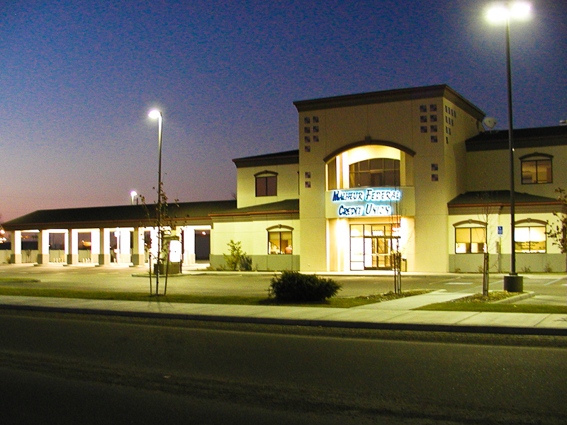
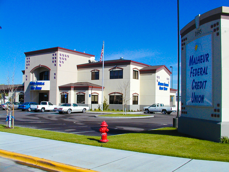
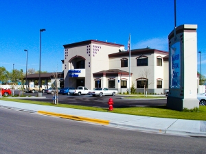 NEW LANDMARK BUILDING IN ONTARIO
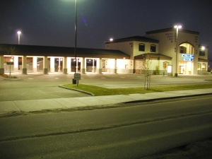
This attractive two story, 12,000 Sq Ft bank building was constructed in 2001.
Designed by local architect John Costner the structure continues to serve the community to this day with its clean lines and comfortable functional interior. Well designed and built to last there have been very few changes from the original design.
The Electrical Design worked closely alongside the Architectural layout to achieve well-coordinated and functional structure that has stood the test of time.
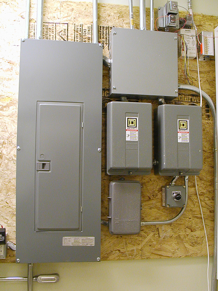
The Electrical Design included Power Distribution, Interior and Exterior Lighting, Fire Alarm, Elevator and the full range of specialized and dedicated bank security systems.
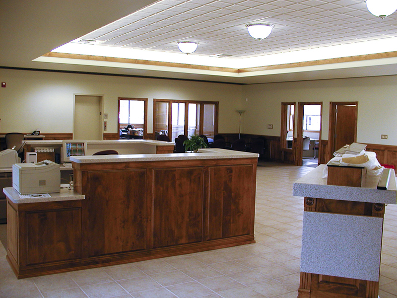
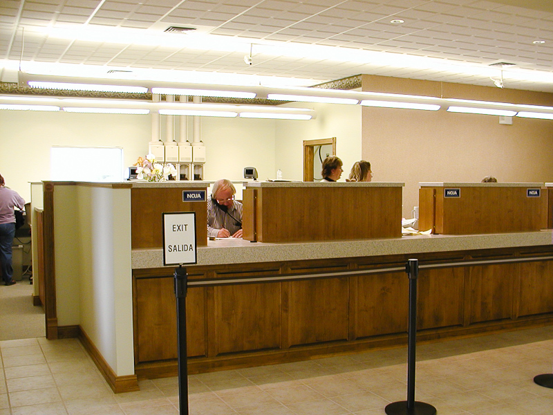
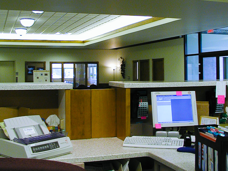
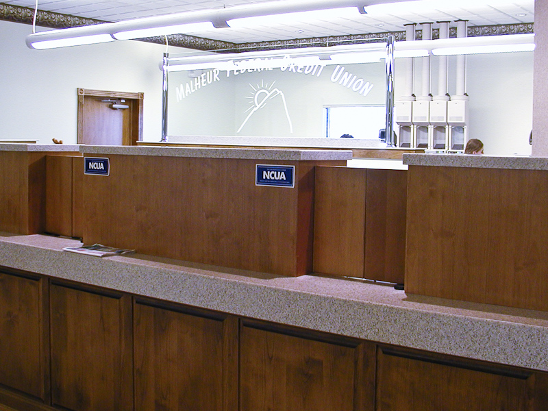
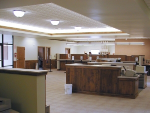
One of the many esthetic features of the bank lobby was the coffered ceiling with its eye pleasing indirect illumination from the hidden light fixtures.
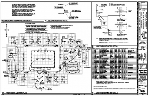
Some of the detail that went into the Electrical Design. First floor lighting plan (Left); part of the 12 sheet Electrical Drawing set for the project.
At the time some of the newer technology in Lighting Design was T8 fluorescent lamps, electronic ballasts and bi-level switching – all of which were incorporated into the Electrical Design.
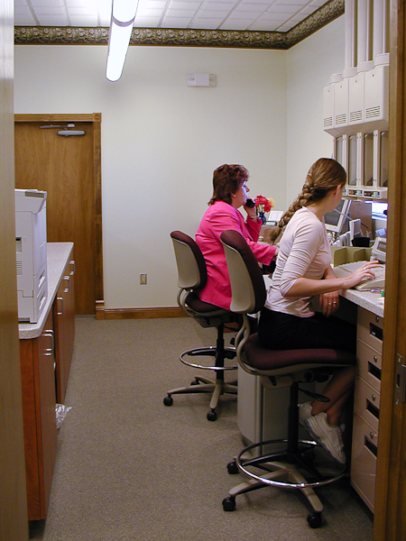
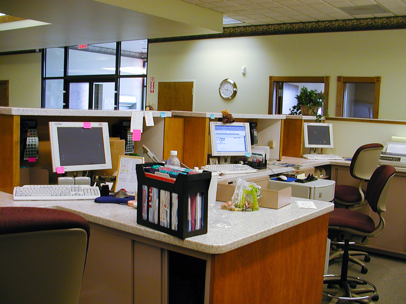
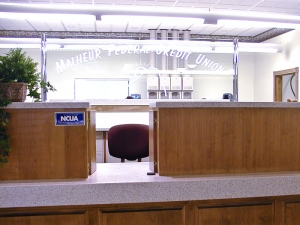 Following the indirect lighting in the lobby, the ambience was carried through teller work area and the conference room. Indirect lighting used in the lobby and work areas tends to produce a softer light, absent of harsh shadows reducing glare.
MR-16 down light fixtures were employed in the ceiling to supplemented the general area lighting above customer transaction portholes to increase brightness. Work areas behind the teller stations used a low glare combination up and down light suspended fixture.
To save energy the design specified near daylight 5000° Kelvin lamps producing a clean business like appearance and taking advantage of the eyes’ enhanced scotopic acuity.
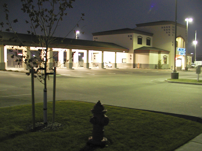
When it came to the exterior the entire 2 acre site needed to be brightly and evenly lighted. The Site Lighting Design employed energy efficient metal halide lamps using pulse start ballasts. These fixtures produce a clean eye pleasing white light.
Similar fixtures were used under the drive through canopy and around the main entrance to tie these areas in.
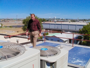
John Costner, AIA; Project Architect (now deceased) on the second story HVAC equipment deck in 2002 during the final days finishing up the project.
The picture (Left) is looking North towards East Idaho Avenue before the days of Home Depot and Walmart but the rear of old Kmart building is visible just above the hand railing.
